---
title: "TailwindCSS on Rails 01: Responsive layout with sidebar"
author: "Yaroslav Shmarov"
date: "2023-08-07"
canonical_url: "https://blog.superails.com/tailwindcss-layout"
markdown_url: "https://blog.superails.com/tailwindcss-layout.md"
description: "As of Rails 7, you can automatically install TailwindCSS when generating a new rails app by running rails new -c=tailwind -d=postgresql."
tags: ["rails","tailwindcss"]
license: "GNU AGPL v3. Credit Yaroslav Shmarov and link the canonical URL."
video_url: "https://www.youtube.com/watch?v=mKNb7G-8jL8"
---
# TailwindCSS on Rails 01: Responsive layout with sidebar
> Tailwind CSS: It looks awful, and it works.
>
> Adam Wathan, TailwindCSS creator
As of Rails 7, you can automatically install [TailwindCSS](https://tailwindcss.com/docs/) when generating a new rails app by running `rails new -c=tailwind -d=postgresql`. Adam also personally helped with the default styles.
I am super excited that [just like me](https://rubyonrails.org/world/agenda/day-2/8-yaroslav-shmarov-session), Adam will be also [speaking on Rails World](https://rubyonrails.org/world/agenda/day-2/7b-adam-wathan-session).
In this mini-series I will cover the main aspects of using TailwindCSS when building a Rails app.
When you create a new Rails app, first of all you want to figure out navigation (navbar, sidebar, footer) and UI responsiveness (make it work on all screen sizes).
Let's build a responsive layout with a sidebar that is replaced by a dropdown on a small screen:
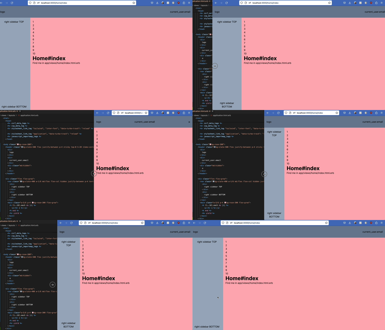
Here's the HTML for this layout:
```html
logo
current_user.email
☰
<% (1..100).each do |i| %>
<%= i %>
<% end %>
<%= yield %>
```
*Colors are present for you to see the different elements.*
Now, it's up to you to give unique styles for each page inside `yield`.
For example, for a page with centered, not full-width content you can do:
```html
New Post
<%= render "form" %>
```
That's it! 🤠
Next step: [Make the navbar dropdown actually work on small screen when the sidebar is hidden](https://blog.superails.com/tailwindcss-dropdown) 🙈