---
title: "TailwindCSS on Rails 02: Responsive dropdown menu"
author: "Yaroslav Shmarov"
date: "2023-08-08"
canonical_url: "https://blog.superails.com/tailwindcss-dropdown"
markdown_url: "https://blog.superails.com/tailwindcss-dropdown.md"
description: "Previously we created a responsive layout: TailwindCSS on Rails 01: Responsive layout with sidebar Now, let's create a dropdown menu that is accessible only on…"
tags: ["rails","tailwindcss"]
license: "GNU AGPL v3. Credit Yaroslav Shmarov and link the canonical URL."
video_url: "https://www.youtube.com/watch?v=vTut_lQJlFE"
---
# TailwindCSS on Rails 02: Responsive dropdown menu
Previously we created a responsive layout: [TailwindCSS on Rails 01: Responsive layout with sidebar](https://blog.superails.com/tailwindcss-layout)
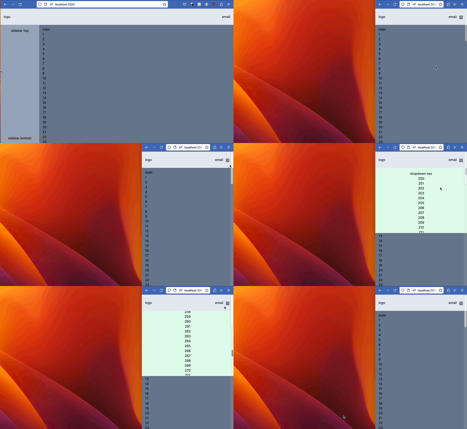
Now, let's create a dropdown menu that is accessible only on mobile (small screen).
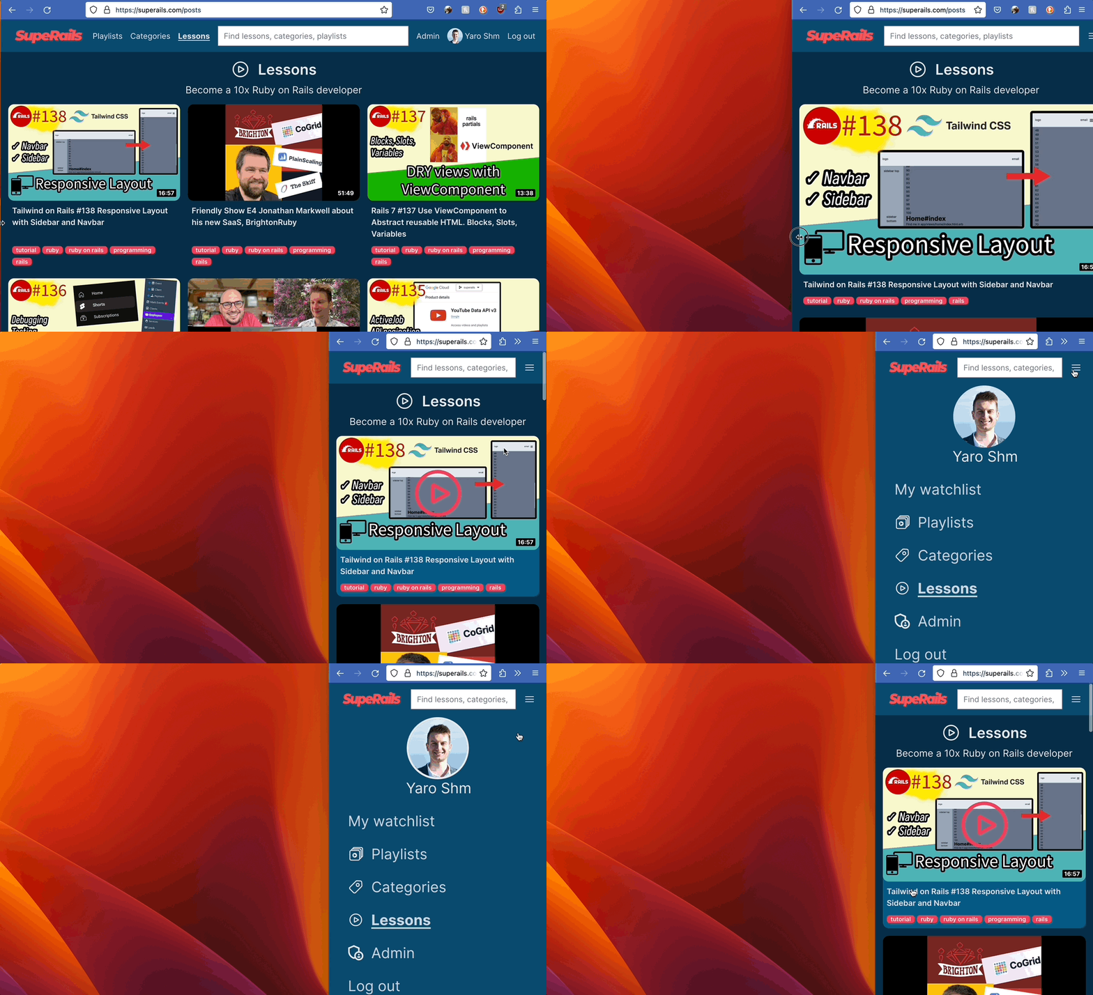
Here's how a perfectly styled mobile menu looks on Superails.com:
But not so fast! Here's the mobile menu that we will build now:
First, add a generic stimulus controller to show/hide content:
```js
// app/javasctipt/controllers/dropdown_controller.js
import { Controller } from "@hotwired/stimulus"
// Connects to data-controller="dropdown"
export default class extends Controller {
static targets = ["content"]
connect() {
this.close()
}
toggle() {
if (this.contentTarget.classList.contains("hidden")) {
this.open()
}
else {
this.close()
}
}
open() {
this.contentTarget.classList.remove("hidden")
}
close() {
this.contentTarget.classList.add("hidden")
}
}
```
Now, update the layout file from the previous post:
```diff
+
+
+
+
main
<% (1..100).each do |i| %>
<%= i%>
<% end %>
<%= yield %>
```
Notice that the "navbar" (with logo and email) and "dropdown contant" are in the same div;
`absolute` class on "dropdown content", because:
- with - dropdown OVER content
- without - dropdown pushes content down
Now the layout file is getting really big, so it makes sence to abstract `navbar` and `sidebar` into partials:
```diff
+ <%= render 'shared/navbar' %>
+ <%= render 'shared/sidebar' %>
main
<% (1..100).each do |i| %>
<%= i%>
<% end %>
<%= yield %>
```
### Advanced mode:
Install `stimulus-use`
```sh
bin/importmap pin stimulus-use
```
* close dropdown by clicking Escape
* close dropdown by clicking outside
* close dropdown if screen size is more than `sm` (768 px)
* hide `` area and display ONLY dropdown on page
* blur ``
* disable scrolling of `` content
```js
// app/javasctipt/controllers/dropdown_controller.js
import { Controller } from "@hotwired/stimulus"
// https://github.com/stimulus-use/stimulus-use/blob/main/docs/use-click-outside.md
import { useClickOutside } from 'stimulus-use'
// Connects to data-controller="dropdown"
export default class extends Controller {
static targets = ["content"]
connect() {
useClickOutside(this)
}
clickOutside(event) {
this.close()
}
closeWithKeyboard(event) {
if (event.key === "Escape") {
this.close()
}
}
closeOnBigScreen(event) {
if (window.innerWidth > 768) {
this.close()
}
}
toggle() {
if (this.contentTarget.classList.contains("hidden")) {
this.open()
}
else {
this.close()
}
}
open() {
this.contentTarget.classList.remove("hidden")
// let main = document.querySelector("main")
// main.classList.add("blur")
// document.body.classList.add("overflow-hidden");
// main.classList.add("hidden")
}
close() {
this.contentTarget.classList.add("hidden")
// let main = document.querySelector("main")
// main.classList.remove("blur")
// document.body.classList.remove("overflow-hidden");
// main.classList.remove("hidden")
}
}
```
Update the navbar:
```html