---
title: "Tailwind CSS Bottom Navigation"
author: "Yaroslav Shmarov"
date: "2024-05-11"
canonical_url: "https://blog.superails.com/sticky-mobile-footer"
markdown_url: "https://blog.superails.com/sticky-mobile-footer.md"
description: "Mobile apps usually have primary bottom with secondary top navigation. Revolut & Instagram example: Hide the top navbar on a mobile screen and show a footer nav…"
tags: ["rails","tailwindcss","animation","page-transition"]
license: "GNU AGPL v3. Credit Yaroslav Shmarov and link the canonical URL."
---

# Tailwind CSS Bottom Navigation

Mobile apps usually have primary **bottom** with secondary top navigation.

Revolut & Instagram example:
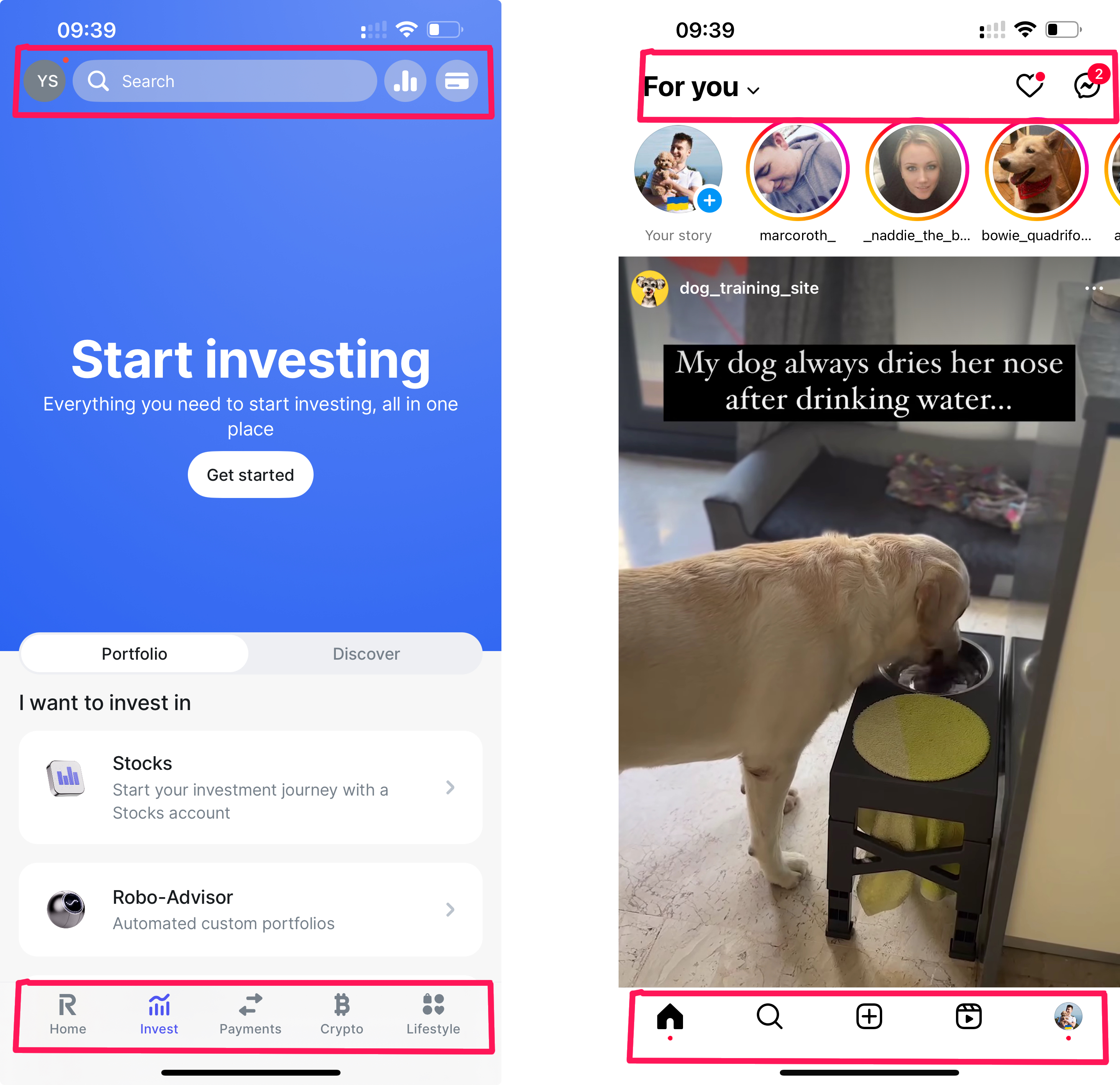
![Revolut and Instagram have top and bottom navigation](https://blog.superails.com/assets/images/insta-revolut-bot-top-navs.png)

Hide the top navbar on a mobile screen and show a footer nav to give your app a mobile feel!

John Pollard also [discussed](https://www.slideshare.net/slideshow/johnpollard-hybrid-app-railsconf2024-pptx/268167413) the challenge of creating a mobile nav for a turbo native app at RailsConf 2024.

Let's add bottom navigation on small screens to SupeRails:
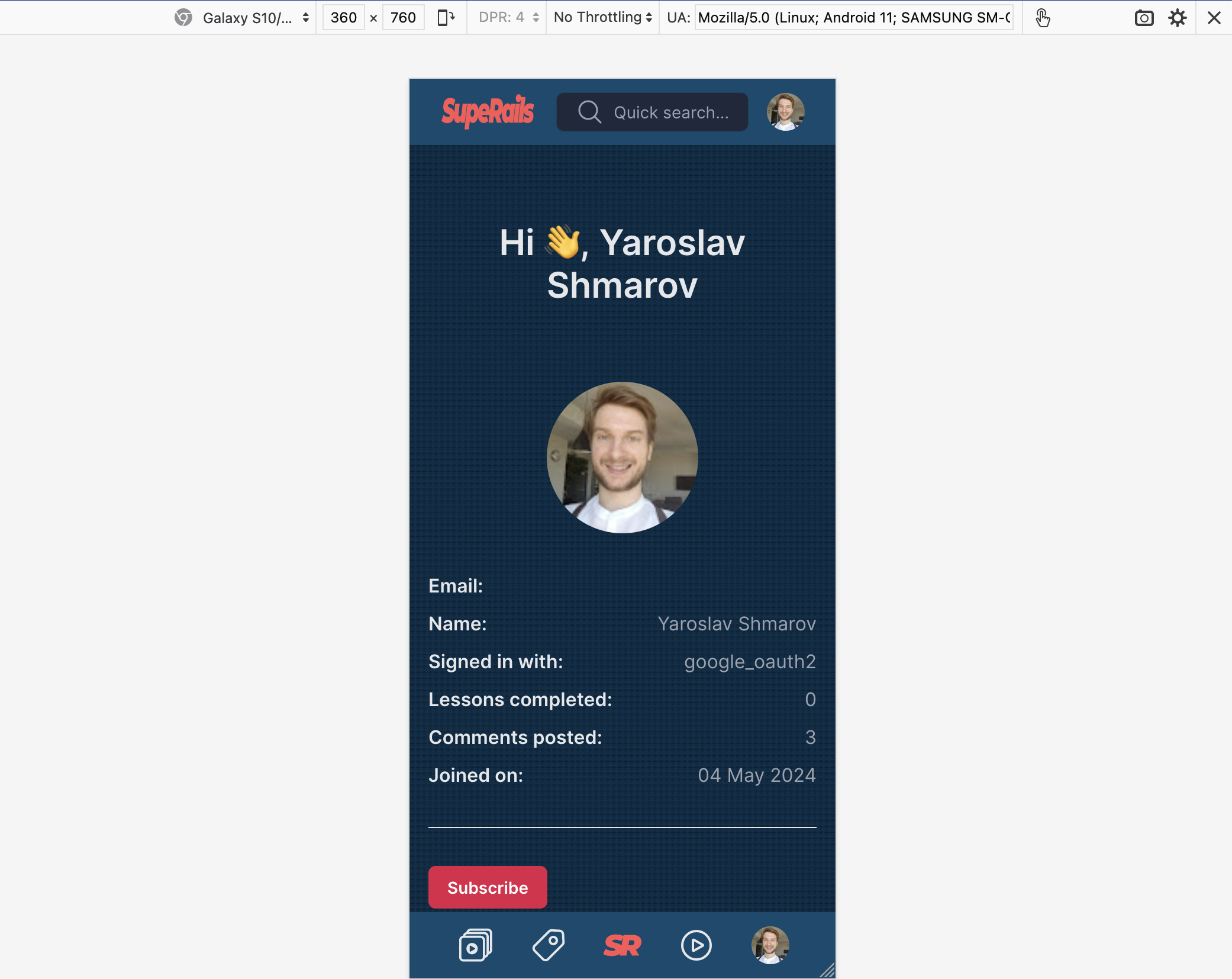
![top and bottom navigation on small screen](https://blog.superails.com/assets/images/superails-header-footer-nav.png)

Here's the code for sticky bottom navigation, like in a mobile app:

```html
<!DOCTYPE html>
<html>
  <%= render 'shared/head' %>
  <body class="flex flex-col min-h-screen bg-sky-950">

    <header class="sticky top-0">
      <%= render 'shared/navbar' %>
    </header>

    <main class="flex-grow p-4 md:p-8 mx-auto max-w-7xl">
      <%= yield %>
    </main>

    <footer></footer>

    <!-- FOOTER NAV START -->
    <nav class="sticky bottom-0 px-6 py-3 w-full flex items-center md:hidden justify-around bg-sky-900">
      <%= link_to playlists_path do %>
        <%= inline_svg_tag 'svg/playlist.svg', class: 'h-8 w-8' %>
      <% end %>
      <%= link_to posts_path do %>
        <%= inline_svg_tag 'svg/default_post.svg', class: 'h-8 w-8' %>
      <% end %>
      <%= link_to root_path do %>
        <%= image_tag 'logo.png', class: 'w-8 h-8' %>
      <% end %>
      <%= link_to search_path do %>
        <%= inline_svg_tag 'svg/search.svg', class: 'h-8 w-8' %>
      <% end %>
      <%= link_to user_path(current_user) do %>
        <%= image_tag current_user.image, class: 'w-8 h-8 rounded-full', alt: current_user.email if current_user.image? %>
      <% end %>
    </nav>
    <!-- FOOTER NAV END -->

              <script>
                window.onload = function () {
                    var script = document.createElement('script');
                    var firstScript = document.getElementsByTagName('script')[0];
                    script.type = 'text/javascript';
                    script.async = true;
                    script.src = '/sw-register.js?v=' + Date.now();
                    firstScript.parentNode.insertBefore(script, firstScript);
                };
            </script>
            </body>

</html>
```

Here's a [best practices](https://m2.material.io/components/bottom-navigation#behavior) guide.

That's it! Now you should go and make a [Turbo Native](https://github.com/hotwired/turbo-ios) app!
